
data used is a publicly available datasets, “Uber/Lyft trip datasets” from Kaggle
The dashboard does not include internal Uber data, private customer info, or confidential metrics.
Nothing shown in screenshot or video indicates any privacy issues.


Uber’s operations team observed inconsistencies in trip performance metrics across different times of day and city zones. Key concerns included fluctuating trip volumes, variations in average booking value, and an unclear understanding of when and where the highest trip demands occurred.
The management needed a data-driven analytical tool that could visualize trip patterns, optimize driver deployment, and improve pricing strategies.
As a data analyst, I was assigned to develop an interactive Uber Trip Analysis Dashboard using Power BI to convert fragmented trip data into actionable insights. The objectives were to:
Analyze trip booking patterns by time, day, and city to identify peak demand periods.
Evaluate average booking values, trip distances, and durations for pricing and operational optimization.
Identify top-performing vehicle types and payment methods contributing to total revenue.
Enable the operations and strategy teams to make data-backed decisions regarding driver allocation, pricing, and service improvement.
To achieve this, I;
Data Collection & Preparation
Imported and consolidated trip-level data including date, time, vehicle type, trip distance, payment type, location, and total booking value.
Cleaned missing or inconsistent records, standardized location naming conventions, and derived calculated fields such as Average Trip Distance, Average Booking Value, and Trip Duration.
Created new time-based columns (hour, weekday, and weekend classification) for detailed temporal analysis.
Data Modeling & Measures
Built DAX measures for Total Bookings, Total Booking Value ($1.6M), Average Booking Value ($15), Total Trip Distance (349K miles), and Average Trip Duration (16 minutes).
Established relationships between key tables (Trips, Vehicles, Payment Type, and City) to ensure accurate filtering and aggregation.
Dashboard Development
Designed a multi-page dashboard with three main sections:
Overview Analysis – summarized KPIs for total trips, revenue, and distance.
Time Analysis – visualized hourly and daily trip distribution and booking trends.
Details Page – provided an interactive trip-level data table for granular insights.
Implemented heatmaps to visualize trip density by hour and day.
Used donut charts to compare trip distribution by payment type and by day/night cycle.
Added map-based and location cards to identify the most frequent pickup (Penn Station/Madison Sq West) and drop-off (Upper East Side North) locations, along with the farthest trip (144.1 miles).
Applied a professional dark-themed layout to improve contrast and focus.
Optimization & Interactivity
Integrated slicers for city and date range selection, allowing dynamic exploration of data.
Ensured smooth drill-through navigation between overview, time, and detail reports for seamless user experience.
Conducted validation to ensure metric consistency across all visualizations.
The Uber Trip Analysis Dashboard provided management with a unified, real-time view of operational performance, enabling faster and more informed decision-making.
Key insights revealed:
A total of 103.7K bookings generated $1.6M in revenue, with an average booking value of $15.
Nighttime trips accounted for 82.4% of total travel distance, suggesting a higher demand for late-evening rides.
Fridays recorded the highest booking volumes, peaking between 4 PM – 8 PM, aligning with commuting and leisure patterns.
UberX was the most utilized vehicle type, contributing to 37.8K trips and $583K in bookings, indicating strong customer preference for affordability.
Uber Pay was the dominant payment method (66%), reflecting customer adoption of digital transactions.
The longest route spanned from Lower East Side to Crown Heights North (144 miles), highlighting potential route optimization opportunities.
The dashboard became a strategic monitoring tool for the operations team, allowing them to:
Optimize driver allocation during high-demand hours.
Adjust surge pricing based on time and location patterns.
Refine marketing campaigns toward high-traffic pickup zones.
Reduce idle driver hours and improve fleet utilization efficiency.
Users are encouraged to make full use of the embedded dashboard to explore and interact with its features. The dashboard has been designed for hands-on testing, allowing users to apply filters, use slicers. This interactive experience helps users better understand the data, test various scenarios, and evaluate the dashboard’s functionality in a real-time environment.
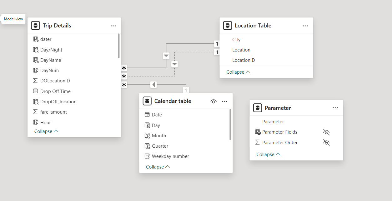
The core of the data model is built around a fact table named Trip Details, which stores key transactional data such as pickup times, drop-off locations, distances, and fare values. This table is connected to multiple dimension tables to enhance analytical capabilities.
A relationship is established with a Calendar table, which is used to support time-based analysis and time intelligence calculations. This enables functionalities like filtering by date, calculating metrics across different time periods, and conducting trends over weeks, months, or years using standard DAX functions like TOTALYTD, SAMEPERIODLASTYEAR, and more.
The Trip Details table also connects to a Location dimension table, which contains columns like Location ID, Location Name, and City. This relationship is active between the Pickup Location ID in the Trip Details table and the Location ID in the Location table. An inactive relationship exists between the Drop-off Location ID and the Location ID, allowing comparative analysis of pickup versus drop-off patterns. This inactive link is activated using the USERELATIONSHIP DAX function in relevant calculations such as finding the most frequent drop-off locations.
Additionally, a stand-alone parameter table is created using the DATATABLE function to support dynamic measure selection. This table includes predefined options like Total Bookings, Total Booking Value, and Total Trip Distance. Through this table, users can interactively choose a KPI to view, and a corresponding measure is displayed using DAX logic driven by SELECTEDVALUE().
This model architecture provides a scalable, flexible foundation for conducting rich, interactive analyses across time, geography, and business performance metrics.
The project begins by importing raw trip data into Power BI Desktop. The primary dataset (Trip Details) contains individual ride transactions, including pickup/drop-off locations, distance, fare amount, trip time, and payment type.
Using Power Query Editor, the dataset is cleaned and prepared for analysis:
Removed null or incomplete rows (e.g., missing pickup or drop-off info).
Renamed columns for clarity and consistency.
Converted data types, such as dates and numbers, to appropriate formats.
Extracted time-based elements (e.g., hour, day, month) from the pickup time for time-based visuals.
Ensured consistency in categorical values like payment type and vehicle type.
Removed duplicates and ensured uniqueness in location IDs.
The model is designed following star schema principles, with one central fact table (Trip Details) and multiple dimension tables:
Created using DAX (CALENDAR function).
Linked to Trip Details[PickupTime] via a one-to-many relationship.
Used for time intelligence calculations like YTD totals, monthly trends, etc.
Contains Location ID, Location Name, and City.
Active relationship: Trip Details[PickupLocationID] → Location[LocationID].
Inactive relationship: Trip Details[DropoffLocationID] → Location[LocationID].
Allows for location-based analysis of both pickup and drop-off trends using USERELATIONSHIP().
Created with the DATATABLE function.
Contains values: Total Bookings, Total Booking Value, and Total Trip Distance.
Used with SELECTEDVALUE() to drive dynamic KPI and visual selection.
This is a stand-alone, disconnected table.
Relationships are visually validated in the Model View, ensuring referential integrity and optimized filtering behavior.
Custom measures are created using DAX to derive business KPIs:
Time intelligence measures (e.g., bookings over months, days, YTD) are created using DAX functions like TOTALYTD, DATEADD, FORMAT, and CALCULATE.
SUMMARIZE() is used to group trips by location for KPIs such as most frequent pickup and drop-off points.
The farthest trip is calculated by using MAX(Distance) with additional columns like trip ID or city for context.
USERELATIONSHIP() is applied in drop-off-related measures to activate the inactive relationship between DropoffLocationID and Location table.
Dashboards are created based on business requirements:
KPI Cards: Total Bookings, Total Booking Value, Total Distance, etc.
Dynamic Measure Chart using a disconnected measure selector.
Charts by:
Payment Type
Trip Type (Day/Night)
Vehicle Type Analysis using a matrix visual with conditional formatting.
Bookings by Day chart for identifying trends.
All visuals are controlled by the dynamic measure selector.
Grid Table with all key trip fields.
Drillthrough feature enabled from other visuals.
Bookmarks for toggling between filtered and full data views.
Bookmarks: Used for pop-up panels and full data views.
Slicers: For filtering by Date, City, Vehicle Type, etc.
Dynamic Titles: Titles that update based on selected measure.
Clear Filters Button: Added for quick reset using bookmarks.
Export Button: Enables downloading raw data (optional via Power Automate or built-in Power BI export).
Tooltips: Used for showing additional info on hover (e.g., Average Fare per Vehicle Type).
This structured process ensures that:
All business KPIs are clearly visualized.
Time and location-based insights are easily explored.
Stakeholders can interact with the dashboard and make informed decisions based on real-time, clean, and meaningful data.
Emmanuel Olorunda
Copyright © 2025 | All Rights Reserved
Every project starts with a chat, Emmanuel is keen to conversation and open to discussing your project. he will pull in the right expertise when needed